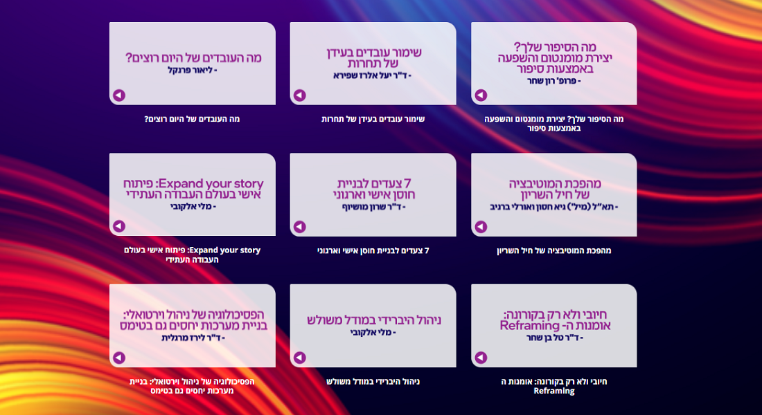
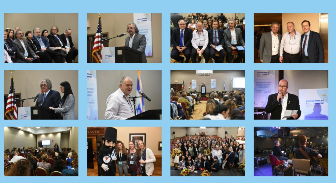
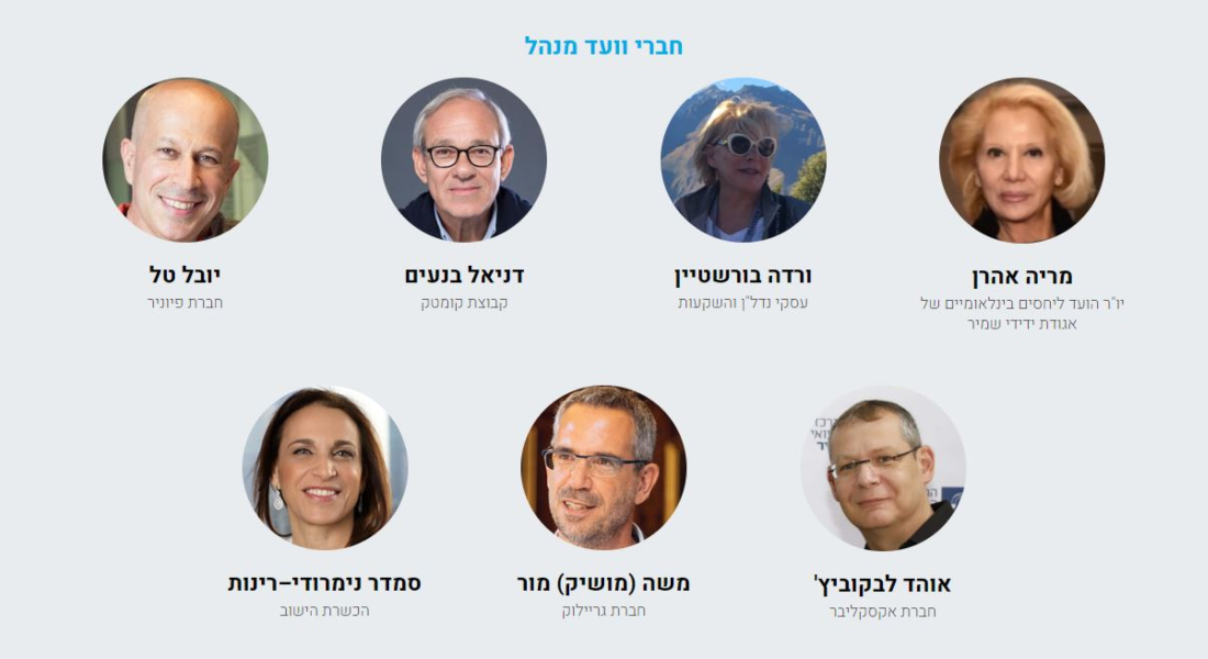
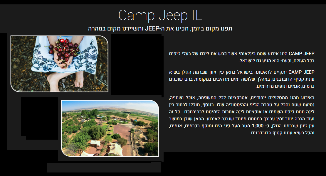
Today it’s already quite clear that a good event website needs various graphic elements to attract visitors and to engage them. Here are our event website graphics recommendations that we would like to share with you, and some examples to show you and inspire you.
Images that will appear next to a text section
- The recommended size for the images: width 600 pixels, height as high as your text.
- It’s essential to be mindful of the source of the images and the copyrights of the photographer.
- If you are not sure – it is always better to give credit when credit is due.
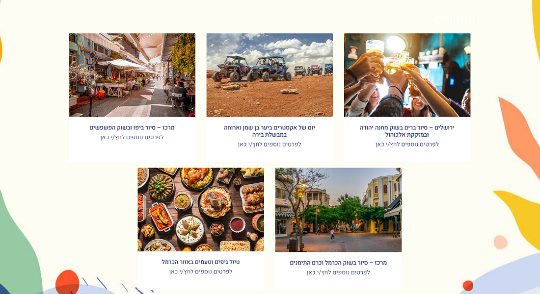
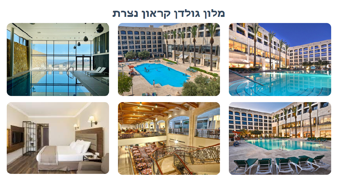
Image Gallery
- Recommended ratio: 4:3 (width 4, height 3).
- Recommended size: minimum width of 600 pixels.
- Important: all the images must be the same size.
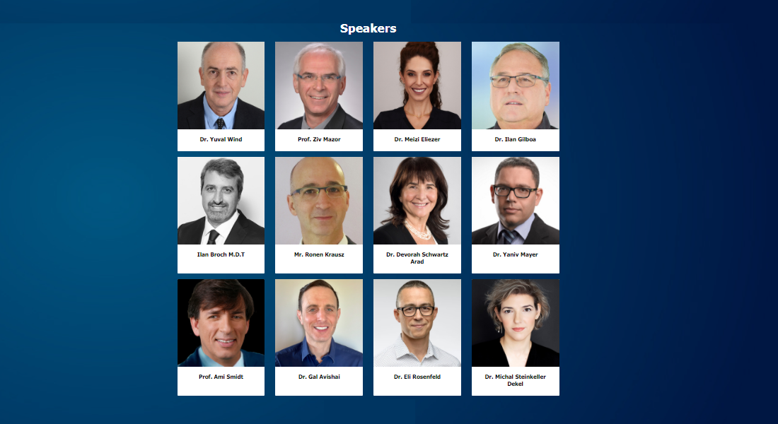
Speakers/Organizers Images
- Recommended size: width 270 pixels, height 300 pixels.
- Important: All the images must be the same size.
- The images can be shown as rectangles with sharp or rounded corners or as circles.
- If the images are to be displayed as circular images, they need to be in the shape of a perfect square.
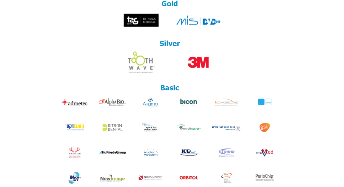
Sponsors/Partners Images
- Recommended size: width 300 pixels, height 160 pixels.
- Important: All the images must be the same size.
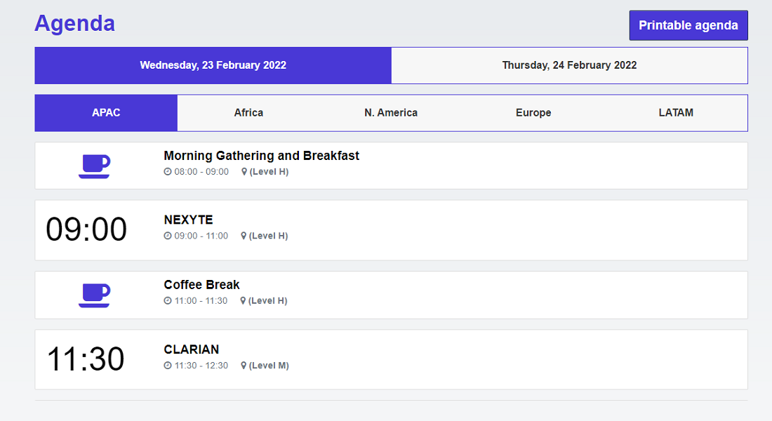
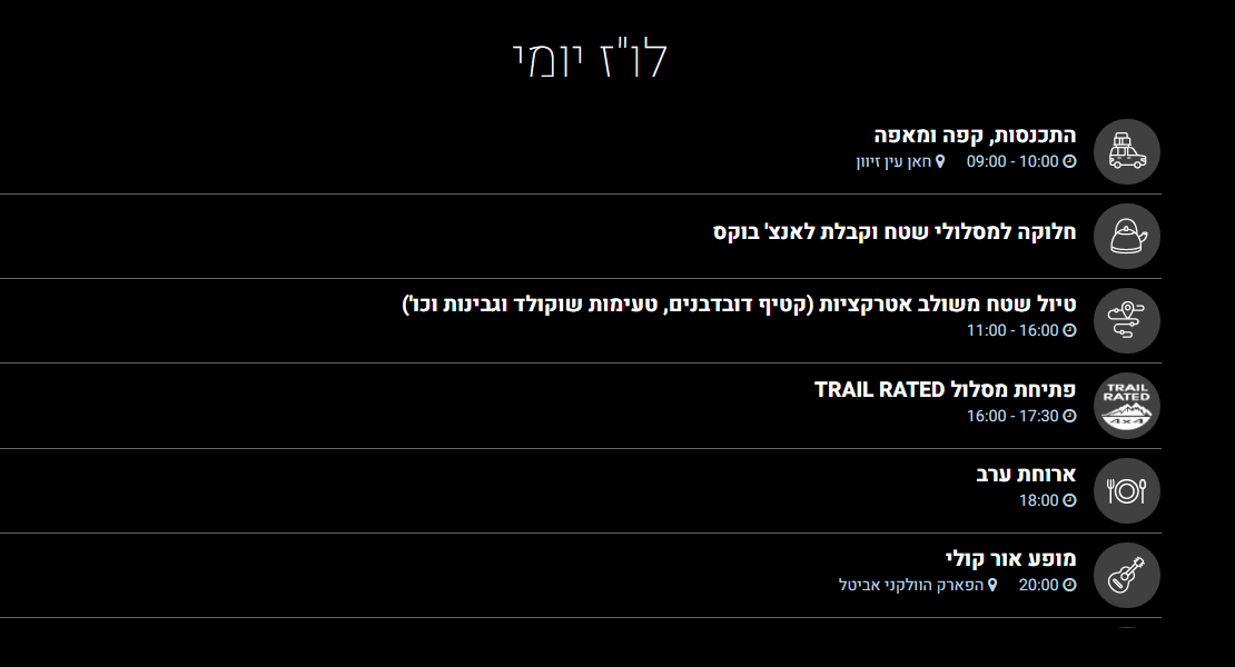
Agenda Images
- Recommended size: width 140 pixels, height 70 pixels.
These are our basic event website graphics recommendations – let us know if you have other things in mind and we will try to accommodate them.
